Mark it down in your calendar – April 21st – Whether you website is responsive or not, it’s going to be a big day.
What’s the Big Deal?
April 21st is the date Google starts to factor in responsiveness – aka how well your website works on mobiles – into their Search Engine Result Position (SERP). There is rumour among the web development community that this penalty will be as big as 30%! It’s very rare for Google to give official prior warning of an upcoming algorithm update, so it seems that these rumours are rather well founded.
What does that mean for you?
What this means is that Google are going to take into account the mobile user experience of a website when considering how to rank it for searches that come from smartphones.
You and your competitors may see a fall or rise in their position based on the websites responsiveness!
What else?
Google will also display something similar to this when you use Google on a Mobile Device: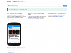
Whenever someone on a mobile website now searches for a website they will see this on the search results, and chances are if they see that the website isn’t responsive, they aren’t going to click on it.
Ultimately this means that if you don’t have a responsive website, you are going to see a large reduction in your organic mobile traffic.
How can I benefit from this?
A lot of your competitors aren’t mobile friendly and as a consequence are going to see a decrease. Now luckily for you, if you make your website responsive you are going to avoid that 30% penalty, as well as get a nice little incentive from Google, placing you above your competitors.
Once you get your foot in the door, you can start climbing up organically on desktop and will start jumping up places.
How do I check?
You can check by going to Google’s website and using their new tool to check how friendly your website is on mobile devices. Keep in mind however that this is not 100% accurate and doesn’t factor in several other elements that Google will be looking for.

The other way to check is to contact us and we will have a look at it for you for no charge, and no obligations or strings attached.
Final Thoughts
Making your website responsive has many other uses, such as improving UX and reducing your bounce rate for mobile users, as we covered in our last blog post.
Having a responsive website isn’t as far away as you might think, and can cost as little as £900 for such a drastic change in your business. Contact us and we can provide you with a free, no obligation quote.